Category: Assignment 1 – Midterm Review – Module 1&2 Blog Posts and Comments

Text to Speech / Screen Reader Experience Reflection
Listening to the screen reading example posted on twitter by Kent Dodds was a real eye opener for me, as before I had never taken into account the ways in which using specialised fonts and non fonts may negatively effect or create difficulty for individuals using screen readers. It was essentially impossible to even put together the fact that those were words within the text when I closed my eyes and tried to follow along with it as the technology spelled each letter with words like “mathematically” before each one, then would read the few words in normal font.
I chose to try the Read Aloud extension for Chrome, and while I could clearly understand each word that was being read by the technology, I found it difficult to follow along as it was being spoken in such a strong monotone, robotic, siri like voice all of the words began to blend together as I became disengaged. I also noticed that whenever there was a question, the tone inflection became weird and distracting. I think it would definitely be more helpful to visually impaired individuals if the screen reading device offered a more humanistic sounding voice to raise engagement and boost the processing of information. As we learned in module one, specifically in learning about the voice principle, higher levels of learning take place when narration is done in a human voice rather than a robotic one. With the advancements in artificial intelligence, it will be interesting to see if companies could potentially take real human voice samples and code those samples to screen read instead of using machine sounding voices.
WAVE Accessibility Report Review

When I ran my WAVE accessibility report, I was happy to find that my blog page did not have any full errors. However, I did have several contrast errors due to the highlight font colour I chose when customizing my blog. I had chosen a light pink colour simply because I thought it was cute. I regrettably wasn’t thinking about how this lack of contrast between the highlight colour and my white background would negatively effect the viewing experience of someone who is visually impaired. The WAVE report and this weeks module was really an eye opener for me, as before I had never really thought about the importance of making sure my blog site as a whole is equally accessible to anyone who wishes to view it.
Going forward, I’m definitely going to change my highlight colour to something that allows for a higher contrast between my background, and will make sure to add closed captions to any videos I post on my blog from now on. Unfortunately I hadn’t realized that not including accurate captions with my video is such an important factor when creating video media, as it can greatly increase viewership and benefit all users.
What Design Principles did I use to Create my Infographic on Canva?
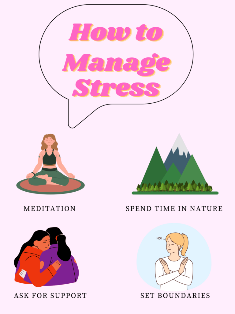
When I created my infographic on canva, I decided against using a template so that I could test out my own ability to use design principles effectively as I have often used templates in the past. One of the design principles I focused on when creating my infographic was the focus on alignment when placing my key points. By aligning the elements in columns and using the negative space of the background in equal proportions, the different elements look much more aesthetically pleasing, while also looking like they have connections to one another. I also used the design principle of hierarchy, and made sure the title heading was much larger and was placed higher than the other elements, so that viewers eyes are drawn to the message of my infographic. Another design principle I used repetition. I stuck to one font throughout for each descriptor, and kept to a cohesive colour pallet. I also made sure that the designs of the graphics I chose looked similar and didn’t clash with one another aesthetically.
Other Principles I considered:
Other than those design principles, I also kept inclusive design principles in mind when creating my infographic. When going over potential fonts, I made sure to choose ones that were simple and easy to read, and ensured colour contrast between the text and the background so that individuals with partially impaired vision or colour blindness could easily view the text.
What Does the Template Make Easier and What Does it Make Harder When Creating my Infographic?
Because I had used Canva before and felt like I had a pretty good grasp on the process of building off of a template, I decided to freeform my infographic using a blank document. I definitely think using a template would have allowed for me to have a more aesthetically complex design, but I like how mine turned out even if it is more simple than some of the templates! It was really fun to use the bank of individual elements and put them together myself in a way I saw fit! I do think that sometimes using a template stifles the creative aspect of building an infographic, as it is easy to completely follow along with the template and leave it at that, or not know how to change certain template elements that are already in place when you start your project.
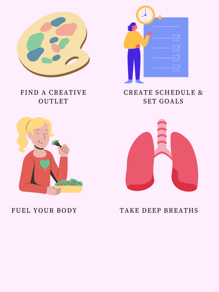
The only downside about using the blank document to create my infographic was that it took up more than one page, and I couldn’t figure out how to save my project so that it would upload as one longer, cohesive page rather than the two documents! It was actually really fun to test out different design elements and spending some time playing around on the Canva site!
My Canva Infographic! Let me know what you guys think!
For my infographic, I wanted to provide easily accessible strategies for students as we enter the first round of mid terms this week! I kept in mind that most students don’t have the time or the budget to take a yoga class or get a massage as a means of momentarily unwinding, and wanted to provide usable solutions that someone could do for a just a few minutes and could be done at home or with minimal cost. I also made this infographic with my knowledge from the psychology courses I’m taking in mind. We learned about how important protective factors are during especially stressful periods, as they allow for individuals to foster higher resilience and decrease the likelihood of negative outcomes such as the development of a mental illness or the habitual use of unhealthy coping mechanisms. Protective factors include positive aspects of one’s environment including a support system, proper nutrition, sleep and physical activity. I wanted to use my infographic as a way to advertise healthy ways of decreasing and coping with stress!


What Inclusivity Means to Me
To me, inclusivity means creating a space that is equally accessible and beneficial to anyone, regardless of differences in ability, race, sexuality or gender. I think that this lesson was a huge learning experience for me, because I learned that creating an inclusive space is an intentional process where diverse needs are kept in mind before creating the learning material. Before I had learned this, I really was not thinking deeply or critically about how my blog would be viewed by a wide range of individuals.

Of all the Principles of Cognitive Theory of Multimedia learning, Which Did I find Most Intuitive?
After reading this week’s articles and watching the videos explaining the many principles of Cognitive Theory of Multimedia learning, I think that one of the most intuitive was the coherence principle. This principle is important when the goal is to maximize the extraneous load felt by students. Extraneous load is described as the cognitive effort that does not help the learner towards the goal of retaining and processing the information, and often arises from poorly designed lessons. The coherence principle helps to reduce this load by omitting unnecessary material meant to spice up the presentation but distracts from the learning material. Robert Mayer specifically warns against the inclusion of what he describes as ‘seductive details’, which include all information that is purely included to be interesting, but is irrelevant. He explains that this information is often retained more than the actual learning material because it is eye catching or emotion inducing; taking away from the lesson at hand. The coherence principle involves only including text, narration and graphics that directly relate to the learning, and promote the use of simple visuals and the avoidance of distractions such as background music.
Which Principle Surprised me the Most?
One of the principles that surprised me the most was the personalization principle, which works to optimize germane load. Germane load is described in the readings as the mental capacity or cognitive activity required in order to integrate the new learning information with existing knowledge as well as process this new information into long term memory. The personalization principle describes that learners retain information from multimedia presentations more effectively when they are presented by an individual who speaks in a conversational style. Instead of using formal, stiff or academic language, speaking in a relaxed and personable tone makes the learners connect much more to the speaker. This is done through the conversational social cues that engage the learner, which encourages active listening. This principle was surprising to me because it was finally able to describe the way I’ve felt in learning scenarios in the past, when I’ve felt unable to engage in a presentation or effectively retain the information at hand because the professor was speaking in a way that was overly academic or simply too dull for me to actively pay attention to. This has often affected how well I do in the class, as that initial lack of information retention makes it more difficult to review when studying for exams. This has also been such a large factor in how much I enjoy the class as a whole, because even if the information at hand is objectively interesting, I’m unable to enjoy my learning experience if the presentation is formal and stiff.
Who Was My Target Audience?
For my first ever screencast, I decided to play around on Canva and give a little tutorial on one of the tools the free site provides. I chose to use the template function and show my audience how to make a professional and well formatted resume by making the template their own. My target audience for this screencast was individuals just beginning to make their ways into the professional sector, which requires the ability to not just build a resume, but have one that is aesthetically professional, well formatted, and easy to read. The first impression a resume provides to potential employers can be important, and it might be hard for individuals just starting out to know how to properly put together a resume, what to include, or how to format it.
I hope you enjoy my first ever screencast! I had a lot of fun putting it together and learning this new technology!
When I was making my screencast, I wanted to make sure to keep my initial little powerpoint simple, and not crowd the slides with too much written information or any unneeded or off topic images. Instead, I just added a few point form notes, categorized in columns in relation to their topic. I also wanted to make sure that I wasn’t just reading word for word what was on the slides, which I avoided by only putting a few words on the slide as prompts for my talking points.
While giving my tutorial of the Canva site, I wanted to make sure I was using pretty casual language and wasn’t speaking in an overly professional manner. The one thing that was a little difficult during the making of this screen cast was the recording process, as I find even when recording my voice alone I still get a little camera shy!
Recent Comments