Author: amiiiraelhafi7
What Generative AI Applications Have I Found Useful?
I have found that ChatGPT is an extremely useful tool. In the past, I have found it really advantageous to use this tool to help me with studying, as oftentimes I will have so many readings to do for an exam but feel like I won’t have enough time to read them all, then begin retaining the information. By using ChatGPT, I can copy my big readings or textbook chapters into the text box, and ask the AI to summarize the information in an organized and detailed way. This allows me to obtain the important points of my readings without having to get through over fifty pages of information that is likely not to be tested. This allows me to feel confident about the information that I am studying, and really decreases the density of my study load, as I often neglect reading my textbooks if I have more time sensitive tasks at hand. ChatGPT is also really a great tool to help individuals come up with study guides or plan out their learning in an effective way. Because of the lack of accuracy with AI tools that often occurs, I don’t often trust them to come up with new information for me, for fear of it being inaccurate, dated or holding biases. To avoid this as much as possible, I always make sure to feed the AI the direct and whole information I want it to work with, and just have it spit it back to me in a more efficient way. Before this class, I had only used ChatGPT, and had never branched out to other open AI tools as sometimes I get intimidated by a different technology than what I am used to and like to stick with what I know how to navigate. I had never heard of or used Stable Diffusion before, had so much fun playing around with it, feeding it different prompts and seeing what it would come up with. I was definitely pleasantly surprised, and a little shocked with how well the images were able to be done, and how you could specify details you wanted the AI to incorporate into the image. I was also surprised at how quickly it is able to generate the image!
What Apps Have You Used That Are Not in the Explore Section?
The only image creator AI I had ever used was the Bing AI chatbot, that utilises the Chat GPT 4 model – which is the one you’d have to pay for on the Chat GPT site. I love using Bing AI to play around with image creation, and had to use the site last semester during an elective I took on the History of Japanese Animation. During one assignment, we had to create an anime style character using popular features of the art genre and could use any mode of creation. Because I am not the most artistically gifted, I opted to use the Bing AI tool, and fed it specific prompts of how I wanted my character to look, and what setting I wanted her to be in. Bing AI is really useful because you can further prompt the AI after the original image is created to tweak it, add details and make it more complex over time without overloading the AI with too much information or too many details all in the first prompt.
This is the image I created! I wanted it to be cute haha, I was really impressed by the details on the fur!

“A bunny wearing a chef hat baking a cake” prompt, Stability AI, Stable Diffusion, Version 2.1, 24 March, 2024, https://stablediffusionweb.com/app/image-generator
I also tried out creating an animation from a drawing on Sketch!! I am not the most artistically talented, especially when attempting to draw something digitally but I think it turned out super cute! Let me know what you think!
What Ethical Concerns do you Have About the use of Some of These Tools?
I do think there are some ethical concerns about the use of AI tools, especially when considering the fact that many of these AI tools could be competing for the same jobs as humans who worked hard to hone their skills in these positions through years of training, schooling and hard work. I think especially in the creative sector, including writing, design, film and music, there is risk of AI replacing human effort as there is potential for the technology to save money and be more time efficient. I also think there are some concerns around the use of AI tools to aid in the completion of assignments and writing tasks in high school and University, which could cause concerns surrounding plagiarism and academic integrity.
What Might you use AI Tools for Moving Forward? What Would you not use Them for?
Moving forward, I would continue to use AI tools to help me streamline my studying and note taking, and could potentially find it useful to use AI tools embedded in sites like Grammarly to revise my writing by checking for mistakes in spelling, grammar or punctuation that I might miss by just reading my paper over. If I had to create and plan out another creative project using something like a storyboard, I also think I’d like to play around using AI to create the images for said process, rather than simply just taking pictures of my process on my phone, or using the alternative of drawing them out by hand. I would still refrain from using AI to create my work for me, as I know that other than it breaching academic integrity, there is pretty great risk for inaccurate, dated and biased information that I can easily avoid by doing my own research and writing my papers myself. I know for many students it may be tempting to use AI tools to help complete assignments faster, because we always have so much going on, but it is important to remember the risks that come from doing so.
SECTIONS Analysis of Twine:
Students- Students are easily able to access this storymaking tool conveniently and affordably! It is so rare nowadays that technologies are free for public use with no paywalls or subscriptions services, especially with the amount of features of the site, such as Javascript. It does require wifi and a computer device for the media, and while this may be a barrier to some students who may not be able to afford a personal computer or laptop, this barrier is mitigated due to the availability of public computers within university campus libraries, as well as public libraries. The use of public wifi services would mitigate this barrier as well.
Ease of Use – Even though I have never been that tech savvy, and sometimes find it difficult to navigate a new tool, I found Twine to be pretty intuitive to use on the basic level! Each function is effectively labelled, making it easy for students and instructors to learn what they need to do and how to add different features as they go along. It would be easy for instructors to point out and explain the functions they wish their students to use, as they are all set up to be simple to find and understand. For more advanced functions such as the addition of conditional logic or the use of Javascript, I believe additional training may be necessary for some users (including me haha), but could the extra training is easily accessible through the “Twine Cookbook” under the help button, which provides tutorials on working with HTML, Working with CSS and Javascript, as well as beginner tutorials explaining the basic functions of the site along with some story examples. I really like how it provides tutorials on the site and does not require students or instructors to search outside of the page for user made tutorials on platforms like Youtube.The site is reliable to use, and is able to be used for its intended purpose of creating a story without extra learning required.
Cost – The site is completely free to use which is a really great factor. However, if you are setting out to make a pretty complex or lengthy story, it may cost the user a few hours of their time, as each addition of the story is added one at a time, and can take a while if you’re adding multiple pathways, then continuing onto each of those pathways.
Teaching – The medium might not directly support good teaching, as it is a pretty niche activity to ask for students to complete, but for classes on creative writing or english I think this would be a really fun and unique way to supplement lessons and get students writing creatively in a way that isn’t just on a page or online document. I think Twine could potentially be used as low as a middle school level, as at that time students would likely be capable of utilising and understanding the functions of the online tool, and would be able to think at the level necessary to create a complex branching story.
Interaction – While this is a great tool, it does not foster a high level of interaction between students within the site, as to my knowledge there are no interactive features that allow for direct collaboration. However, students could easily collaborate on one story by working together in person and using one device together to make their story. Students can creatively interact with the given content by reworking it into their own story or pathway of connected learning concepts, which allows for increased consolidation of information.
Organisation – I am not quite sure what is available support wise from UVIC to develop, maintain or access this technology. Before this class, I had never heard of Twine before, which may be a reflection of a lack of institutionally backed access. However, if an individual sought out library resources or information technologies they may have information about the Twine tool.
Networking – I do not think Twine would be the best tool to use if you wished to widen networks and include more people in the course by using a medium. It works best as a creative way to process the course content or come up with new material, but does not provide functions that allow for connections to be made between people within or outside of the course. However, connections could be formed between the learners by sharing their twine stories with each other by exporting them outside of the platform into an HTML, which Twine is capable of.
Security – I am not quite sure of the security policy of twine, but it is an open platform and does not require the user providing their personal information such as an email, name or password.

What Authentic Problem Would you use to Design a Lesson Using Merrill’s Principles?
An authentic problem I thought of to use to design a lesson effectively using Merrill’s Principles could be attempting to educate youth about the importance of taking care of their mental health. This practice often happens within a school setting, but may be ineffective if the material is only covered through a lecture or guest speaker, which as we learned is not an effective way of ensuring students are retaining and processing information. I’ve been learning in one of my psych classes that transitional periods such as late childhood and early adolescence can be difficult or more stressful for many individuals. This can lead to symptoms of mental illness presenting themselves and becoming persistent if youth don’t have effective support systems in place, or don’t have effective self strategies for coping with these periods and supporting their mental well being.
One of Merrill’s principles describes that learning is promoted when relevant previous experiences are activated, and that one of the best ways to start a lesson of a new concept is by first recognizing which past knowledge can be built off of. In this instance, activation can take place through providing a small chunk of time for students to break off into groups and discuss what mental health means to them, why it is important to take care of and potential ways this could occur. This allows for students to think back to times in their own lives where they’ve received or provided help during a difficult time and how that was beneficial.
Another principle that could be used is Merrill’s idea that learning is promoted when learners are engaged in solving real world problems. Because the lesson is on the topic of mental health, this is a crucial principle to remember. Instead of rattling off statistics, educators could put together case studies highlighting common mental health issues within adolescents, such as feelings of depression or anxiety, and give students the opportunity to brainstorm potential ways to help alleviate symptoms, before explaining themselves what would be best for each scenario.
The principle that learning is promoted when the instruction demonstrates what is to be learned would also be an important one to use. As Merrill explains, it is much more effective to show than tell when providing learners with information. A demonstration could involve the modelling of ways to take care of one’s mental health, such as coping strategies that may include practising mindfulness meditations, seeking help from a trusted adult or peer or showing where to find professional resources.
What Media or Multimedia Would I Create to Support It?
For this material, I think that I would create an interactive lesson accompanied by a multimedia presentation. The multimedia presentation could help guide the principles I have highlighted above by prompting breakout periods with students and asking the class for their input on case studies while visually and audibly portraying the important material of the lesson.
To further involve the students in this learning experience, after the multimedia presentation, an interactive practice of a mental wellness strategy could take place. A great way to include this could be for students to settle into their seats and close their eyes, focusing on their breathing. The teacher could find a guided meditation online, or write one themselves. These meditations often involve the vivid description of a serene, calming place, and asks the individual to picture themselves there and think of how they’re feeling. This is a great grounding and calming strategy that is super accessible, as students once they learn about this method of mindfulness are able to find similar ones on free sites such as Youtube or Spotify.
My Lesson Plan:
What Was Your Experience Trying Out H5P?
I had a really positive learning experience trying out H5P’s interactive learning tools. The instructional module was extremely helpful as it was clearly laid out and provided useful step by step instructions of how to set up the technology within wordpress. The site offered many more options than I was initially expecting, and provided a multitude of great teaching materials with so much variety to ensure that one would likely fit into each educator’s unique lesson plan. Each tool was customizable in a really intuitive way, and I found it easy to figure out what to do even though it was my first time. I chose to use the interactive image feature that was provided, which allows for students to learn from an image in a way that is more immersive. This feature is perfect for complex images with multiple important features, diagrams and graphs.
My H5P Interactive Learning Object! Let me Know What You Think!
For my H5P interactive learning object, I chose to create an interactive image that learners can explore. Because this module was so focused on the psychological and cognitive reasonings behind why individuals fail to retain information in an effective way when learning occurs passively, I wanted to lean into those concepts a little bit in my interactive learning tool. With this in mind, I decided that I wanted to make my interactive learning tool a diagram of the human brain. By using simple language and phrasing allow for learners from a wide range of ages and past knowledge banks to gain some insight on the different parts of the brain and their basic functionings. I had a lot of fun figuring out how to use this learning tool.
How Have I found the Balance of Passive and Active Learning in This Course? How Does it Compare to My Experience in Other Courses?
I have found that the balance of passive and active learning in this course has been really beneficial, and feel that there have been few other courses I have experienced with this much emphasis based on active learning. I have found it much easier for me to remember the course content in detail, as there is such an emphasis on truly understanding the material and showing that understanding through the assignments and reflection questions each module. Oftentimes in my classes, I find myself mindlessly trying to memorise all the information for assessments, which I then immediately forget as soon as the midterm is complete. In the majority of my psychology courses, and even in most of the electives I have taken, course material has been delivered to students as they sit silently in a massive lecture hall, as a professor clicks through a powerpoint and explains the slides. We sparsely have a few minutes of time in a class to discuss what we’re learning with a partner or group.
I Hope You Enjoy my Video! I Had So Much Fun Making It!
What is the Purpose of My Video?
The purpose of my video was to teach my audience how to make a simple and easy chocolate chip cookie recipe. I wanted to convey the idea that baking can be a fun activity that anyone can do, even if they don’t have prior experience. By choosing a simple recipe with pretty minimal ingredients, it’s much more likely that most people would have these ingredients in their homes, and could easily follow along with the steps of the recipe as I do in the video.
Why is Video a Good Medium for this Learning Purpose?
One of the main ways that video makes for a good medium when learning how to bake cookies is because it provides a visual demonstration. Sometimes when just reading the steps to a recipe off of a page or website, it can be hard to understand the exact process that will allow for the recipe to be a success. Especially if you’re new to baking and are not sure of some specific cooking terms, watching a professional on a video can be super helpful. It can also be helpful to see the consistency or texture of what the mixture should look like after beating. It can sometimes be hard to tell what ‘beat together until light’ means, so it’s helpful to see a video demonstration of how the ingredients are supposed to look when combined. It could also be helpful to see how the cookies should look when you’re taking them out of the oven, for example how brown they should be on the top.
Another reason video is a great medium for instructions is because of its accessibility aspect. If a visually impaired individual wanted to bake cookies, they may have a hard time reading the small print of a recipe in a cookbook or off a website. The audio descriptions provided with an instructional video allow for these individuals to follow along with the recipe by hearing the instructions rather than reading them.
Which Principles We’ve Learned this Term did I incorporate into my Design and Why?
I kept the redundancy principle in mind during the making of my video. Instead of using both written instruction blurbs on each instructional segment, I remembered that the redundancy principle explains that people learn better from just images and narration than images, narration and written text. I used voice overs to add my narration into the background of my video, rather than using written instructions over top of the video. That being said, I still of course opted into adding text in the form of closed captions to the bottom of my video, as I kept in mind the importance of using closed captions to boost the inclusivity of my video, which widens the potential audience and ensures that individuals who may be hard of hearing or just wish to watch the video on mute are still able to enjoy and learn from my content.
I also kept the coherence principle in mind, which describes the idea that extraneous graphics, sounds or words that are solely interesting and not essential to the learning material are introduced into the presentation; they can often result in increased cognitive load for learners. This one was a little harder to follow, as I will admit that it was tempting to use fun special effects or transitions during the editing process that would have made the video more entertaining, but would have taken focus away from the learning purpose.
Another principle I kept in mind was the modality principle, which describes that learners retain information more effectively from pictures or videos and spoken word rather than picture and printed words. This principle draws ideas from the dual channel assumption. With this principle in mind, I chose to use a voice over along with my video, rather than writing the baking instructions on the screen. If both text instructions and video or images are on the screen at once, it can often overwhelm learners’ visual channels. Rather than only stimulating the visual channels, using spoken voice utilizes the auditory channel as well.
What Was Challenging About Capturing Your Own Video?
The most challenging part for me was putting all of the clips of footage together in a cohesive way. I don’t have much experience with video capturing or editing, and I found it a little difficult as it was not intuitive to me. However, I used iMovie which did not take long to get used to, as it is a pretty simple site which makes things way more straightforward. Another challenge was because I had so much footage filmed, it was hard to cut clips down by a lot, even when I needed to. I was worried I would be leaving something important out, but after I did, I realized it made the video way more effective and concise, as I know my audience would rather receive all their instructions in only a few minutes rather than having to sit through a ten minute video. I also found it challenging to add closed captions to my video, as I added each closed caption line manually which took a lot of time in order to line up each text box with each piece of speech. It definitely took a lot of trial and error to line everything up perfectly.
What Did I Find Easiest?
I found it pretty easy to film each clip as I went along in the baking process, and actually ended up with a lot more footage than I needed for my video. I was worried about having unnecessary and distracting background noises from the steps I needed to complete for the video, like the electric mixer. So, instead of saying the instructions while I did each step in the video, I filmed all the content I needed, muted each video to get rid of background noise and was able to voice over the instructions in a quiet environment where I could focus on what I needed to say. I found the filming process really fun, especially because one of my friends offered to film the footage I needed with me, it was a much more enjoyable process than if I was doing it alone. It also made it so much easier to get the shots I wanted, as I didn’t have to worry about setting my phone up on an object or trying to film with one hand and add ingredients with the other.
What Would I do Differently Next Time?
Next time I would definitely like to utilise more interesting filming techniques, as I found that all of the shots I captured were basically just straight on visuals of what was happening. While this does convey the message in a simple and effective manner, I do think it would have been more captivating to my audience if I used a variety of different angles or other filming techniques. I would have also liked to be able to figure out how to add a dark background colour to my white closed captions to make them easier for individuals who choose to read the video captions to see. I noticed that in some points of the video when the captions appear on a lighter background, they’re a little harder to see. I couldn’t figure out how to add a dark background to the caption text boxes to make them pop out to the viewers, I’d definitely do that differently next time as I know this is an important way that makes the closed captions more effective.
My Script:
Hello everyone! For my video for a learning purpose I’m going to be showing you how to make cookies!
preheat your oven to 350 degrees Fahrenheit.
Next, grab a large mixing bowl
We’re going to start by adding our dry ingredients. First, add three cups of all purpose flour.
Then add one teaspoon of baking soda
Next, add a half teaspoon of baking powder
Finally, add a pinch of salt.
Set that aside and grab another bowl
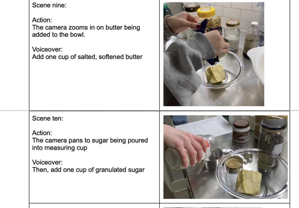
Add one cup of salted, softened butter
Then, add one cup of granulated sugar
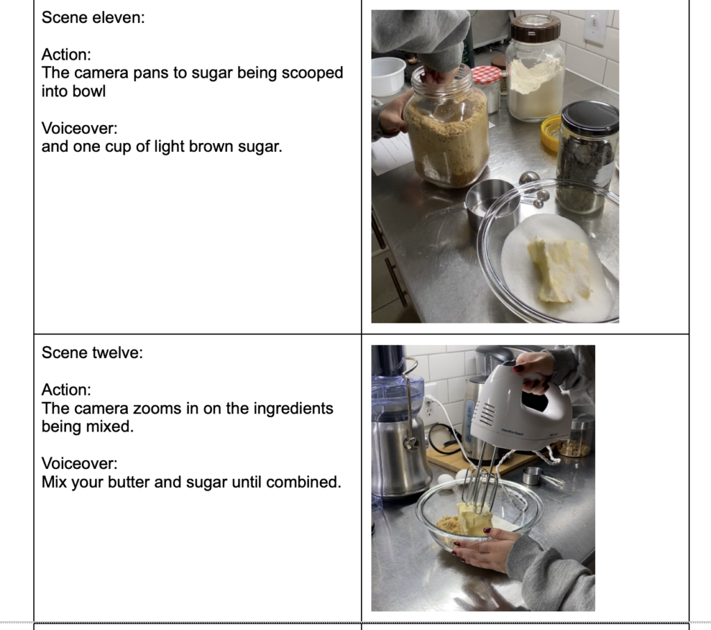
and one cup of light brown sugar.
Mix your butter and sugar until combined.
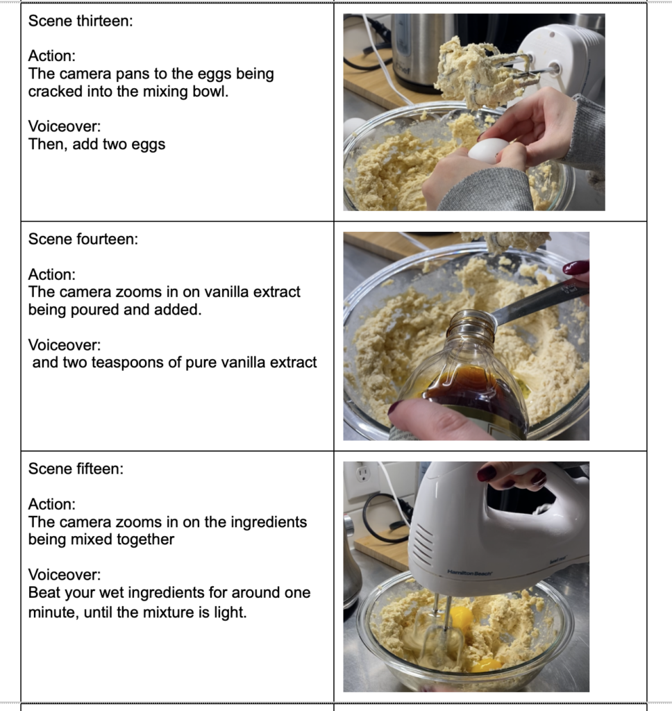
Then, add two eggs and two teaspoons of pure vanilla extract.
Beat your wet ingredients for around one minute, until the mixture is light.
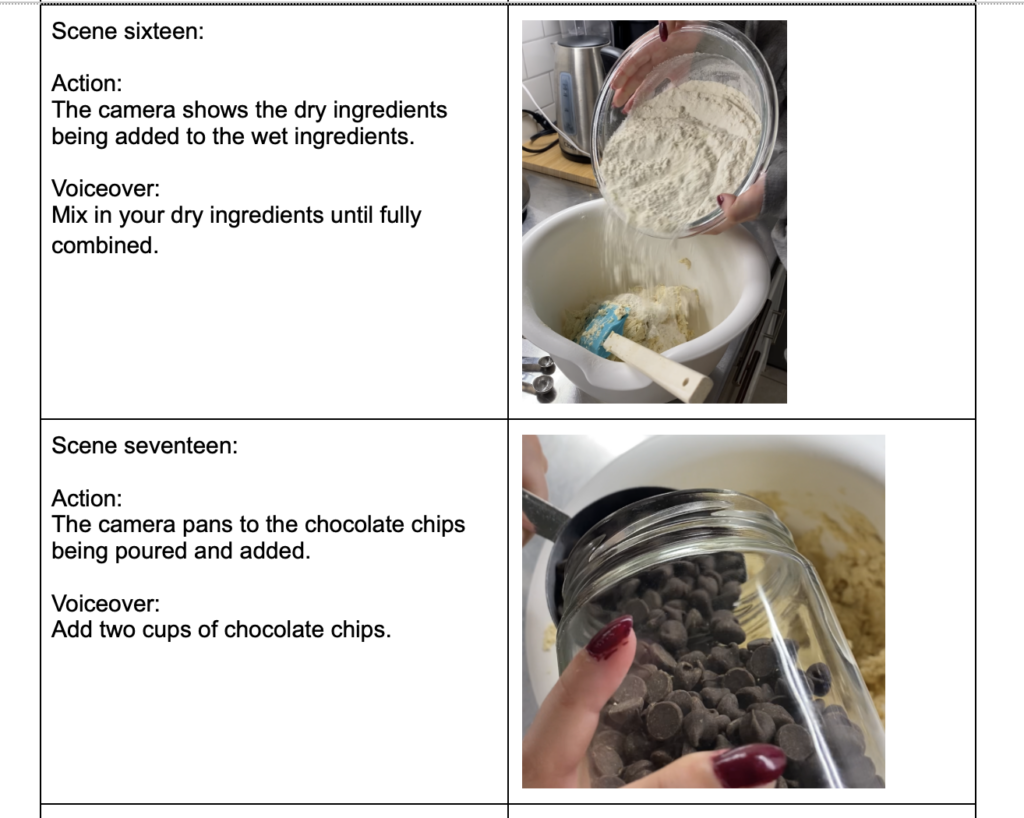
Mix in your dry ingredients until fully combined.
Add two cups of chocolate chips.
Mix thoroughly
Then, depending on how big you like your cookies, hand roll two to three tablespoons of dough onto a parchment covered cooking sheet.
Bake for around 8-10 minutes, and take out of the oven when golden brown
Transfer them to the cooling rack and let cool.
Enjoy some delicious cookies!
My StoryBoard:
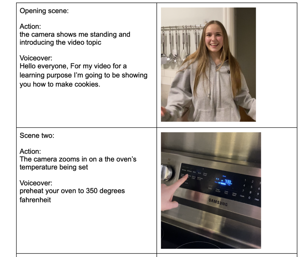
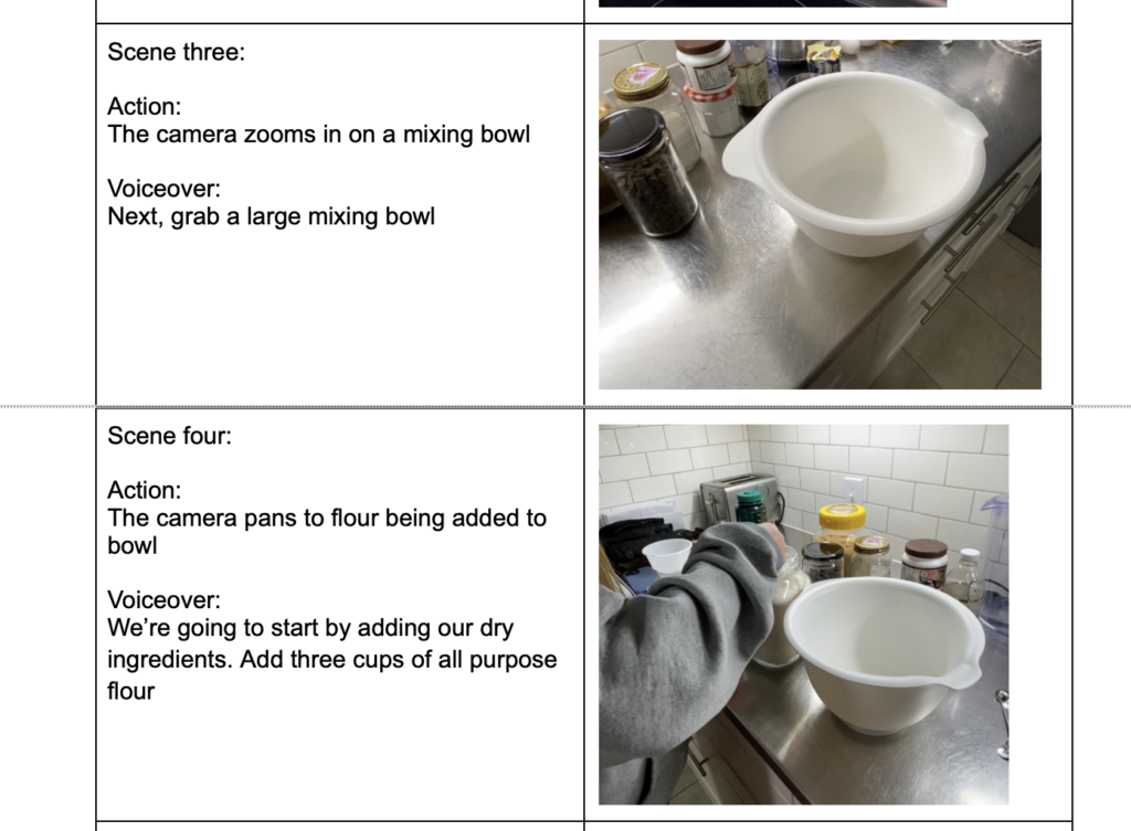
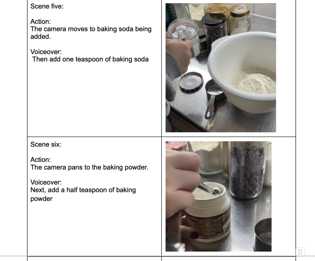
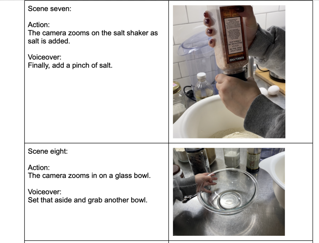
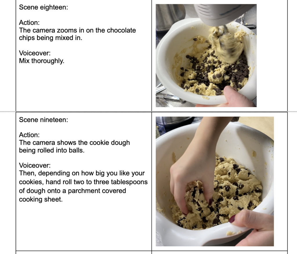
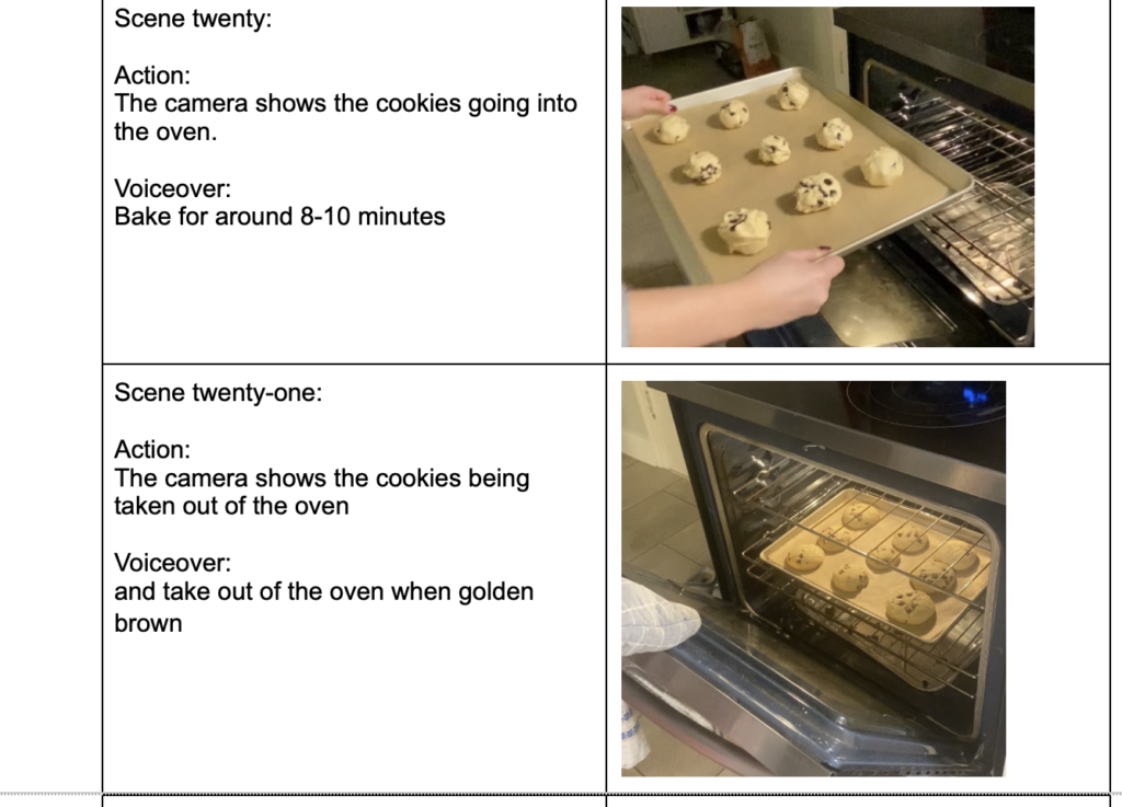
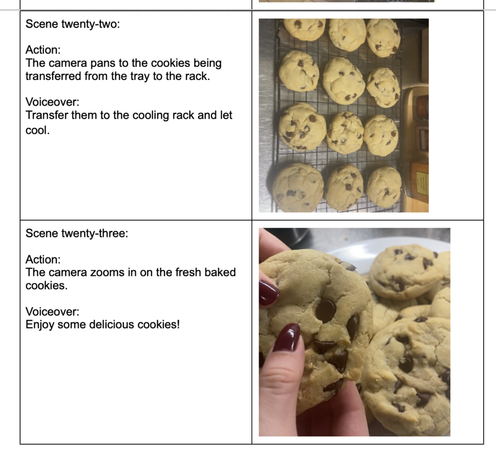

What Learning Experience Does a Branched Narrative like Twine Provide for Learners?
A branching narrative like Twine provides an interactive experience for learners that can act as an enriching addition to a lesson or learning experience. This can often increase engagement with learning material and allow for learners to feel that they have some agency over their learning experience as they make choices in the branched narrative. Branching narratives also provide the challenge of allowing learners to practise decision making and critical thinking skills, as they are presented with multiple decisions that lead to varying quality of outcomes. They must evaluate the decisions and attempt to understand which would lead to the best outcome, weighing different options they’re presented with. It also provides them with a fun environment to practise learning from mistakes and trying new processes when something doesn’t work the first time around.
Where Else do you Come Across Branched Narratives?
One of the most popular examples I thought of for other branched narratives was the choose your own adventure books I used to read as a kid. Based on decisions you made within the story, you would have to jump to different parts of the book to continue the plot you’ve chosen for yourself to continue. Another popular example would be some story based video games.
In The Reading This Week, 7 Storytelling Techniques Used by the Most Inspiring TED Presenters, Which of the Presenters did you Find Most Compelling? What Technique(s) did you Recognize in Their Talk?
The “7 Storytelling Techniques Used by the Most Inspiring TED Presenters” article provided great insight and presented many compelling presenters who utilized effective storytelling elements. One of the presenters I thought was the most compelling was Richard Turere, who told a captivating and inspiring story about his homeland of Kenya, and the problem that his community faced. He told the story of how the lions in the area around his village would attack and kill the livestock his people depended on as one of their main sources of food, and that the solution before his invention was to kill the lions. I noticed several storytelling techniques Richard used to inspire his listeners and grab their attention. First, he was effectively able to immerse his audience into the story, by using imagery and simple language to make the story easy to understand and immerse yourself in. He was able to effectively use visual aids that captured attention and evoked emotion in listeners even though they were sometimes graphic, like the half eaten carcass of a cow. This was a personal story which portrayed the triumph against adversity, which made listeners emotionally invest themselves into what the presenter was saying. I also noticed that Richard was able to create suspense by providing the story in chronological order, presenting the conflict in a way that conveyed its importance, and created a tale of triumph as he described figuring out the solution to protecting their livestock and avoiding killing the lions.
To use the link copy and paste it into google!! Its not working when you just click:( Here’s the link to play my twine story! I had so much fun making it let me know what you think!
https://amiraelhafi.itch.io/edci-337-twine: Blog Post 3: Storytelling and Creating Video
Text to Speech / Screen Reader Experience Reflection
Listening to the screen reading example posted on twitter by Kent Dodds was a real eye opener for me, as before I had never taken into account the ways in which using specialised fonts and non fonts may negatively effect or create difficulty for individuals using screen readers. It was essentially impossible to even put together the fact that those were words within the text when I closed my eyes and tried to follow along with it as the technology spelled each letter with words like “mathematically” before each one, then would read the few words in normal font.
I chose to try the Read Aloud extension for Chrome, and while I could clearly understand each word that was being read by the technology, I found it difficult to follow along as it was being spoken in such a strong monotone, robotic, siri like voice all of the words began to blend together as I became disengaged. I also noticed that whenever there was a question, the tone inflection became weird and distracting. I think it would definitely be more helpful to visually impaired individuals if the screen reading device offered a more humanistic sounding voice to raise engagement and boost the processing of information. As we learned in module one, specifically in learning about the voice principle, higher levels of learning take place when narration is done in a human voice rather than a robotic one. With the advancements in artificial intelligence, it will be interesting to see if companies could potentially take real human voice samples and code those samples to screen read instead of using machine sounding voices.
WAVE Accessibility Report Review
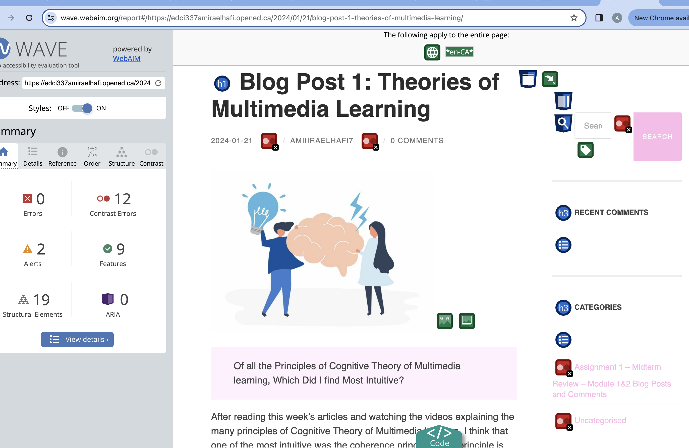
When I ran my WAVE accessibility report, I was happy to find that my blog page did not have any full errors. However, I did have several contrast errors due to the highlight font colour I chose when customizing my blog. I had chosen a light pink colour simply because I thought it was cute. I regrettably wasn’t thinking about how this lack of contrast between the highlight colour and my white background would negatively effect the viewing experience of someone who is visually impaired. The WAVE report and this weeks module was really an eye opener for me, as before I had never really thought about the importance of making sure my blog site as a whole is equally accessible to anyone who wishes to view it.
Going forward, I’m definitely going to change my highlight colour to something that allows for a higher contrast between my background, and will make sure to add closed captions to any videos I post on my blog from now on. Unfortunately I hadn’t realized that not including accurate captions with my video is such an important factor when creating video media, as it can greatly increase viewership and benefit all users.
What Design Principles did I use to Create my Infographic on Canva?
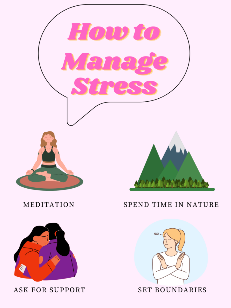
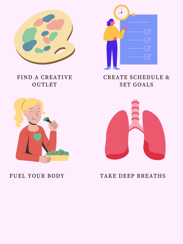
When I created my infographic on canva, I decided against using a template so that I could test out my own ability to use design principles effectively as I have often used templates in the past. One of the design principles I focused on when creating my infographic was the focus on alignment when placing my key points. By aligning the elements in columns and using the negative space of the background in equal proportions, the different elements look much more aesthetically pleasing, while also looking like they have connections to one another. I also used the design principle of hierarchy, and made sure the title heading was much larger and was placed higher than the other elements, so that viewers eyes are drawn to the message of my infographic. Another design principle I used repetition. I stuck to one font throughout for each descriptor, and kept to a cohesive colour pallet. I also made sure that the designs of the graphics I chose looked similar and didn’t clash with one another aesthetically.
Other Principles I considered:
Other than those design principles, I also kept inclusive design principles in mind when creating my infographic. When going over potential fonts, I made sure to choose ones that were simple and easy to read, and ensured colour contrast between the text and the background so that individuals with partially impaired vision or colour blindness could easily view the text.
What Does the Template Make Easier and What Does it Make Harder When Creating my Infographic?
Because I had used Canva before and felt like I had a pretty good grasp on the process of building off of a template, I decided to freeform my infographic using a blank document. I definitely think using a template would have allowed for me to have a more aesthetically complex design, but I like how mine turned out even if it is more simple than some of the templates! It was really fun to use the bank of individual elements and put them together myself in a way I saw fit! I do think that sometimes using a template stifles the creative aspect of building an infographic, as it is easy to completely follow along with the template and leave it at that, or not know how to change certain template elements that are already in place when you start your project.
The only downside about using the blank document to create my infographic was that it took up more than one page, and I couldn’t figure out how to save my project so that it would upload as one longer, cohesive page rather than the two documents! It was actually really fun to test out different design elements and spending some time playing around on the Canva site!
My Canva Infographic! Let me know what you guys think!
For my infographic, I wanted to provide easily accessible strategies for students as we enter the first round of mid terms this week! I kept in mind that most students don’t have the time or the budget to take a yoga class or get a massage as a means of momentarily unwinding, and wanted to provide usable solutions that someone could do for a just a few minutes and could be done at home or with minimal cost. I also made this infographic with my knowledge from the psychology courses I’m taking in mind. We learned about how important protective factors are during especially stressful periods, as they allow for individuals to foster higher resilience and decrease the likelihood of negative outcomes such as the development of a mental illness or the habitual use of unhealthy coping mechanisms. Protective factors include positive aspects of one’s environment including a support system, proper nutrition, sleep and physical activity. I wanted to use my infographic as a way to advertise healthy ways of decreasing and coping with stress!
What Inclusivity Means to Me
To me, inclusivity means creating a space that is equally accessible and beneficial to anyone, regardless of differences in ability, race, sexuality or gender. I think that this lesson was a huge learning experience for me, because I learned that creating an inclusive space is an intentional process where diverse needs are kept in mind before creating the learning material. Before I had learned this, I really was not thinking deeply or critically about how my blog would be viewed by a wide range of individuals.
Of all the Principles of Cognitive Theory of Multimedia learning, Which Did I find Most Intuitive?
After reading this week’s articles and watching the videos explaining the many principles of Cognitive Theory of Multimedia learning, I think that one of the most intuitive was the coherence principle. This principle is important when the goal is to maximize the extraneous load felt by students. Extraneous load is described as the cognitive effort that does not help the learner towards the goal of retaining and processing the information, and often arises from poorly designed lessons. The coherence principle helps to reduce this load by omitting unnecessary material meant to spice up the presentation but distracts from the learning material. Robert Mayer specifically warns against the inclusion of what he describes as ‘seductive details’, which include all information that is purely included to be interesting, but is irrelevant. He explains that this information is often retained more than the actual learning material because it is eye catching or emotion inducing; taking away from the lesson at hand. The coherence principle involves only including text, narration and graphics that directly relate to the learning, and promote the use of simple visuals and the avoidance of distractions such as background music.
Which Principle Surprised me the Most?
One of the principles that surprised me the most was the personalization principle, which works to optimize germane load. Germane load is described in the readings as the mental capacity or cognitive activity required in order to integrate the new learning information with existing knowledge as well as process this new information into long term memory. The personalization principle describes that learners retain information from multimedia presentations more effectively when they are presented by an individual who speaks in a conversational style. Instead of using formal, stiff or academic language, speaking in a relaxed and personable tone makes the learners connect much more to the speaker. This is done through the conversational social cues that engage the learner, which encourages active listening. This principle was surprising to me because it was finally able to describe the way I’ve felt in learning scenarios in the past, when I’ve felt unable to engage in a presentation or effectively retain the information at hand because the professor was speaking in a way that was overly academic or simply too dull for me to actively pay attention to. This has often affected how well I do in the class, as that initial lack of information retention makes it more difficult to review when studying for exams. This has also been such a large factor in how much I enjoy the class as a whole, because even if the information at hand is objectively interesting, I’m unable to enjoy my learning experience if the presentation is formal and stiff.
Who Was My Target Audience?
For my first ever screencast, I decided to play around on Canva and give a little tutorial on one of the tools the free site provides. I chose to use the template function and show my audience how to make a professional and well formatted resume by making the template their own. My target audience for this screencast was individuals just beginning to make their ways into the professional sector, which requires the ability to not just build a resume, but have one that is aesthetically professional, well formatted, and easy to read. The first impression a resume provides to potential employers can be important, and it might be hard for individuals just starting out to know how to properly put together a resume, what to include, or how to format it.
I hope you enjoy my first ever screencast! I had a lot of fun putting it together and learning this new technology!
When I was making my screencast, I wanted to make sure to keep my initial little powerpoint simple, and not crowd the slides with too much written information or any unneeded or off topic images. Instead, I just added a few point form notes, categorized in columns in relation to their topic. I also wanted to make sure that I wasn’t just reading word for word what was on the slides, which I avoided by only putting a few words on the slide as prompts for my talking points.
While giving my tutorial of the Canva site, I wanted to make sure I was using pretty casual language and wasn’t speaking in an overly professional manner. The one thing that was a little difficult during the making of this screen cast was the recording process, as I find even when recording my voice alone I still get a little camera shy!
Hello my EDCI 337 peers! My name is Amira El-Hafi and I’m a third year psychology student at UVIC. I’m taking this course as an elective as I was super interested in learning more about the different types of media that are able to be used to engage individuals in learning. I took EDCI 338 last semester and loved learning about PLNs and their involvement in similar fields! In terms of my academic interests, I’m most interested in child and adolescent psychology, and am eager to learn the ways in which media can be involved in a child’s education!
In my free time, I love grabbing coffee or treats with friends, which we often take to go to enjoy the beautiful scenery Victoria has to offer by taking walks by the beach (even when the weather is less favourable haha). I also love going on hikes and attend several hot yoga classes each week. Between work and school its so nice to have space within the week to clear my mind and move my body!
Looking forward to getting to know everyone more and communicating in the learning pods!

Recent Comments